About the new ACE - Adelaide Contemporary Experimental
About the name-change
With the defined ACE acronym, we recognise and celebrate the ‘Experimental’ legacy of AEAF and the ‘Contemporary’ vision of CACSA in our year-round program of free exhibitions by practicing South Australian, Australian, and international artists.
“In changing our name to a fixed acronym and re-launching our brand, we are matching ACE’s visual language to the energy and maturity of our artistic programming and signalling our special place in the world,” says ACE Artistic Director, Patrice Sharkey.
“The open nature of the ACE Open acronym has always been well intentioned – that is, it served as an open invitation for what the organisation can be and do. After six years of operating, the organisation has grown-up (so to speak) and established its place within the wider arts community. While we remain a flexible and responsive space for art and artists, we also know exactly who we are: situated on Kaurna Land in Adelaide, we support and celebrate art that is contemporary and experimental.”
About the brand identity
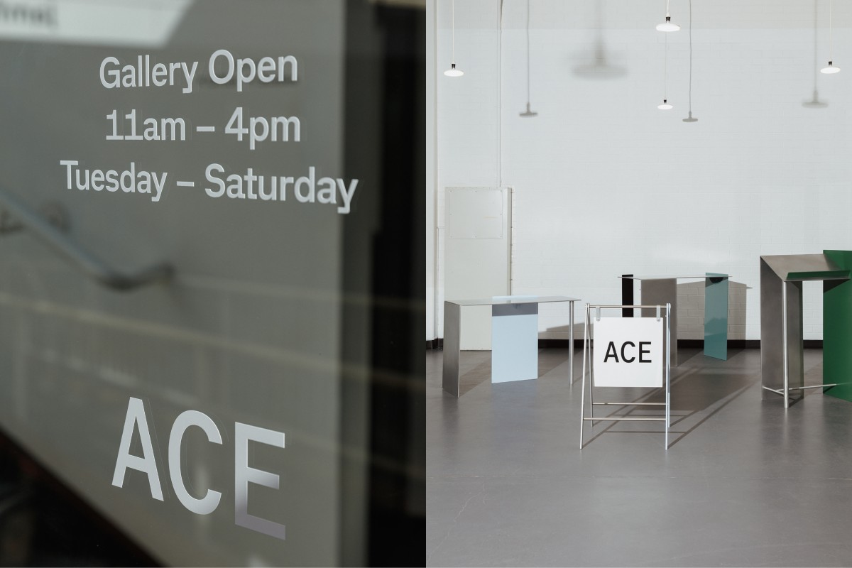
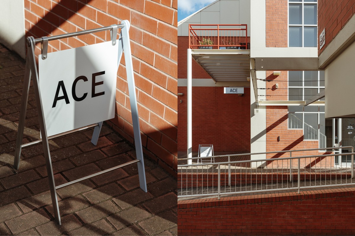
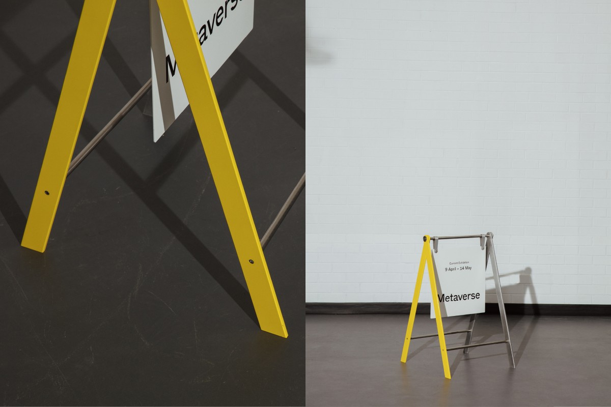
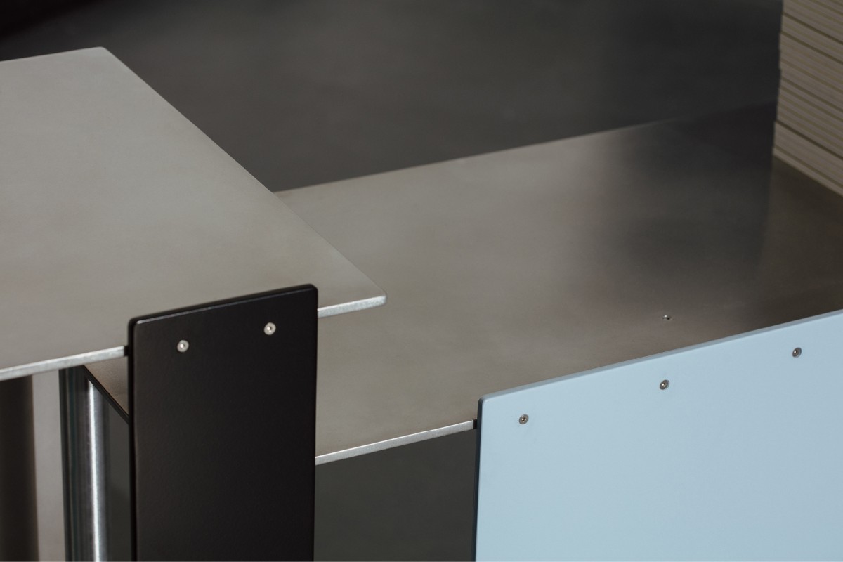
We worked with the next generation of talented South Australian creatives on the website and brand identity to signal the organisation’s new era, including; designer Tyrone Ormbsy (Person Books, Super Assembly); Adelaide-born type and graphic designer Dennis Grauel; interior and furniture designer Claire Markwick-Smith; and illustrator and designer Jasmin Neophytou.
“From the outset of this exercise it was important that this project would feed back into the local economy and support local artists and creative industries,” says Patrice.
“We're extremely proud of the small team of young creative professionals that we trusted to deliver this re-brand for ACE; all of whom are incredible South Australian talent. What they have created for ACE is sensitively considered, flexible, playful, and evergreen.”
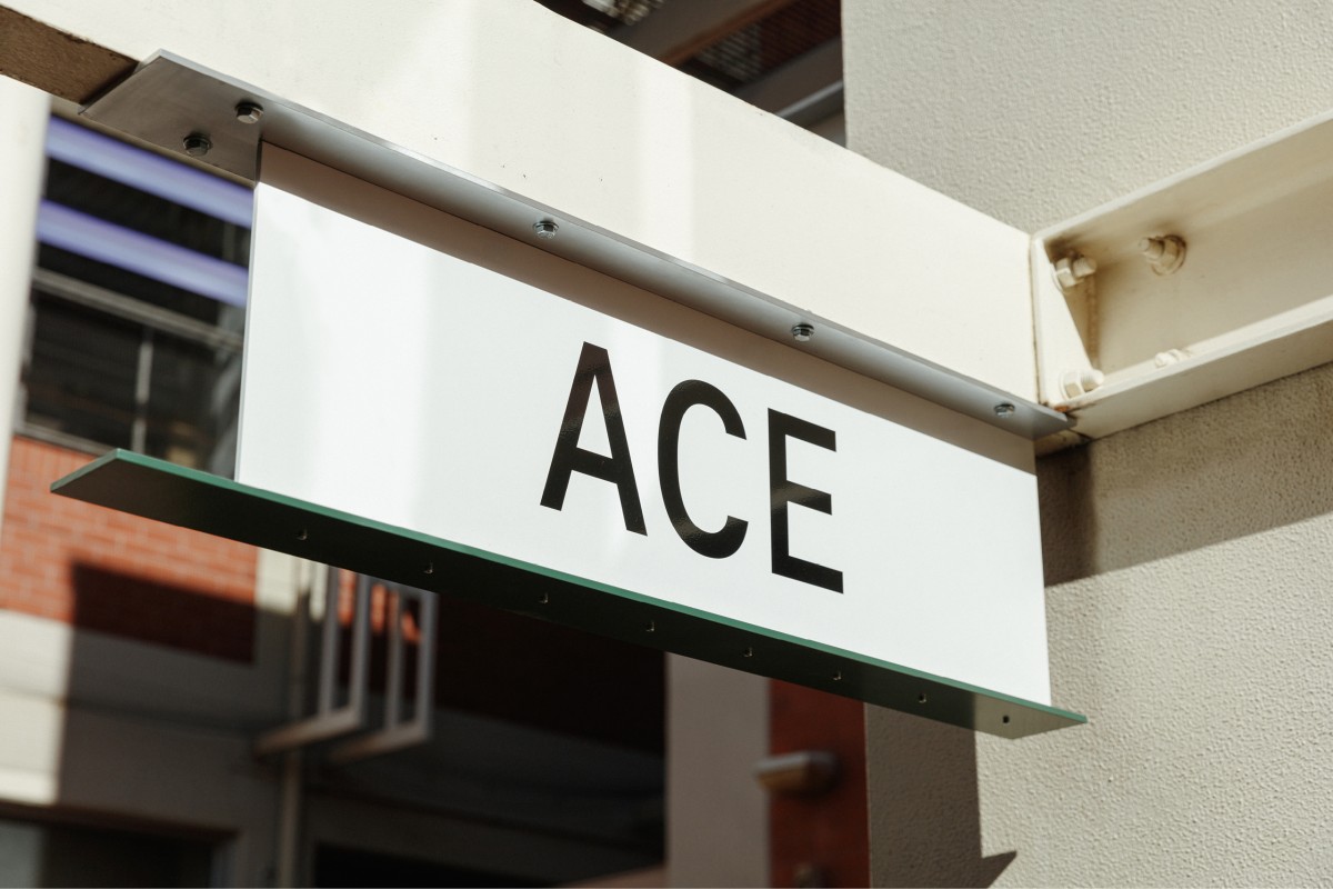
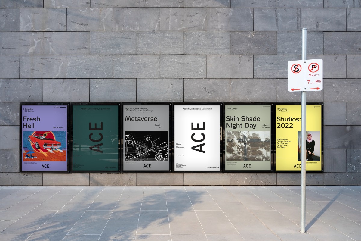
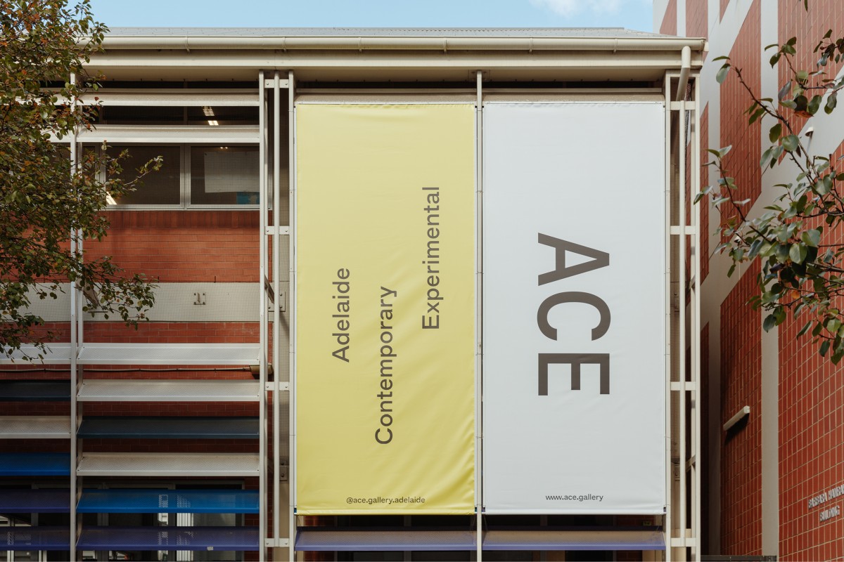
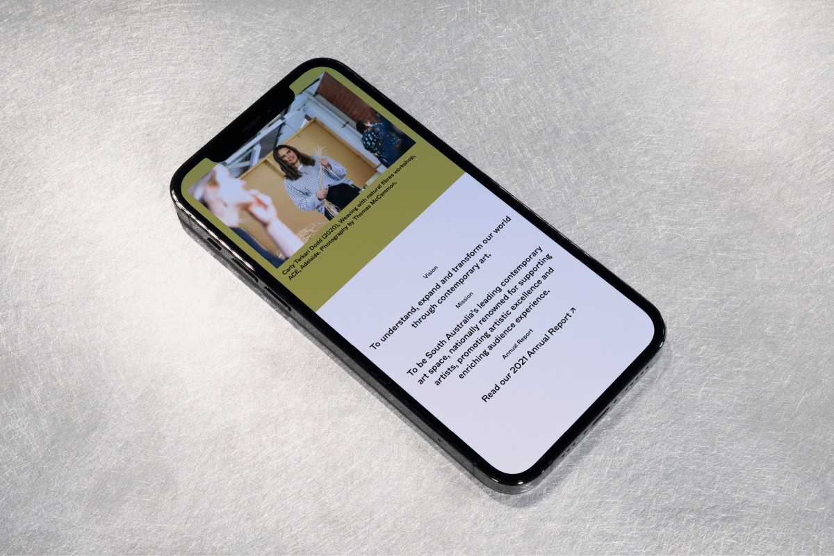
ACE's new type-driven brand identity focuses on communication, accessibility, and experimentation. Tyrone undertook extensive research into the archives of CACSA and AEAF for inspiration; ACE is the custodian of these archives that contain the historic legacies of CACSA and AEAF.
From that, Tyrone and Dennis Grauel designed a custom typeface called ACE. The ACE typeface contains humanistic, idiosyncratic, inky letterforms full of the character and warmth found throughout much of the archive's printed matter.


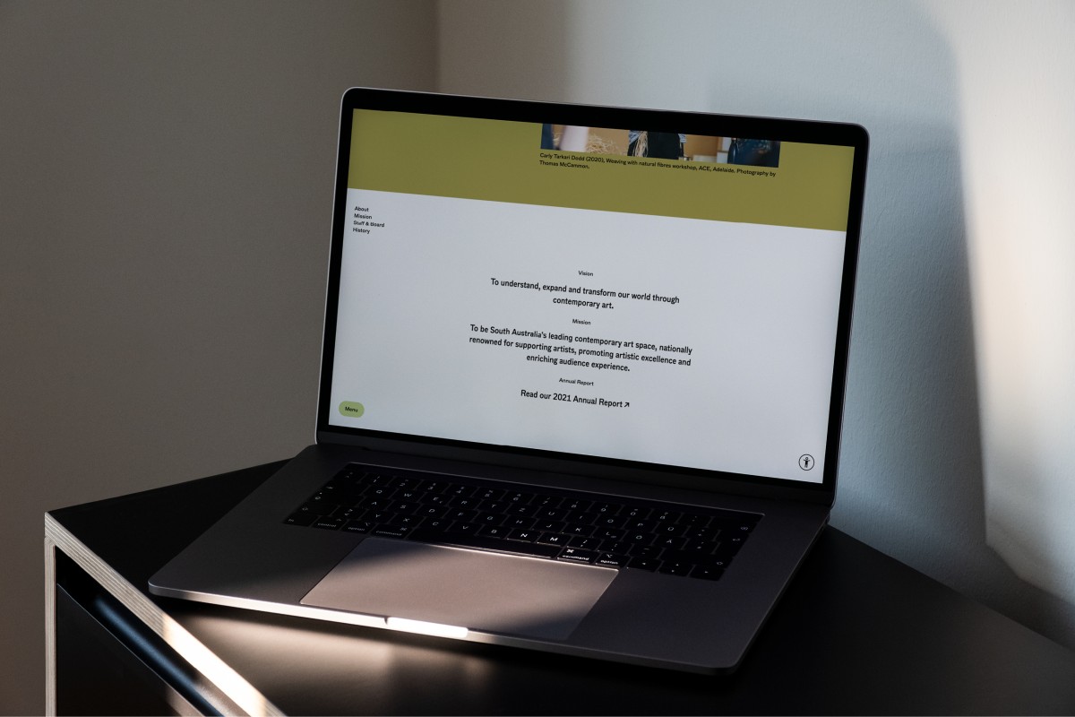
About the website
The new website has been designed and developed by Person Books in consultation with Rockethouse and ACE. ACE was awarded $100,000 from Arts SA to invest in new digital infrastructure to offer audiences alternative modes of connection as part of its Covid support and recovery package.
The new custom-built site is fully accessible to accommodate auditory, cognitive, neurological, physical, and visual access.
The site sets a benchmark for accessibility and integration of new technology that will allow us to move deeper in the digital age to commission and present artworks online, as well as dynamic video and interactive artist content. First up, this includes new video commissions by South Australian artists Tamara Baillie and Henry Jock Walker, and a new Welcome to Country video commission by South Australian emerging filmmaker Kiara Milera that will be released during NAIDOC Week (July 2023).
Creative Direction
Tyrone OrmsbyTypeface
Dennis GrauelFurniture
Claire Markwick-SmithA-frame
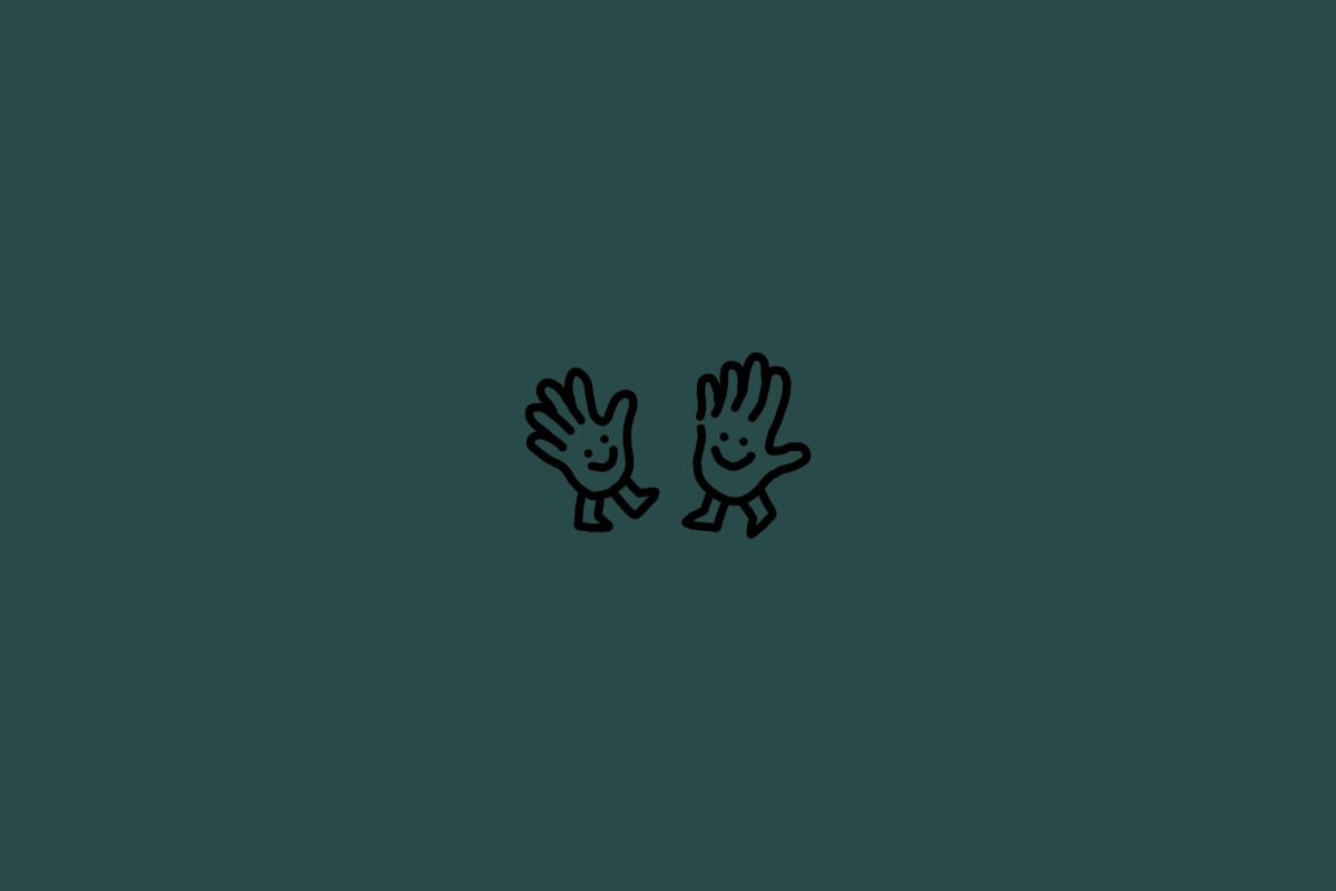
Tom GolinIllustration
Jasmin NeophytouWeb Development
RockethousePhotography
Jonathan van der Knaap